
Going, going, gone… #8
Ten of my favourite works at this week's Old Masters auctions at Christie's and Sotheby's in London
As I said introducing my previous posts on this theme, we try to go to as many viewings as we can at the big auction houses in London: you get to see so many wonderful works of art as they pass briefly from private collection to private collection. This week the focus has been on Old Masters. I’ve picked ten of my favourites here – a mix of the big-ticket items and perhaps more idiosyncratic choices. Obviously I loved many more than ten!
Anyway, in no particular order…
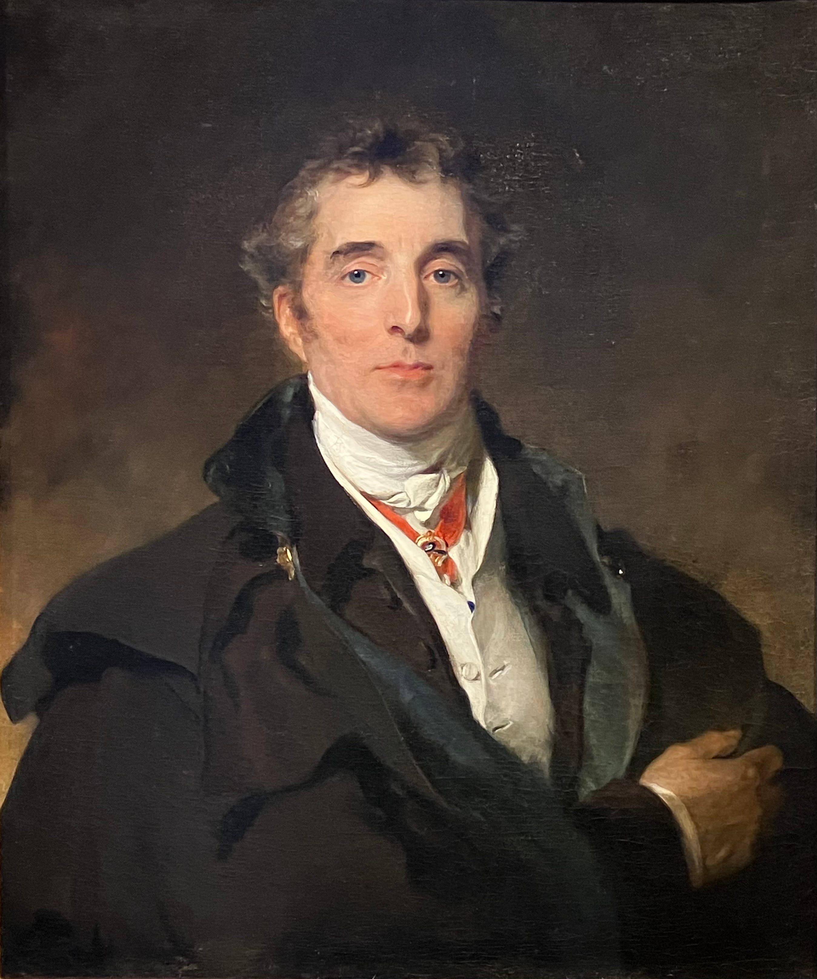
No. 1. Portrait of Arthur Wellesley, 1st Duke of Wellington, by Sir Thomas Lawrence
What a face. Sir Thomas Lawrence painted the Duke of Wellington, his friend and exact contemporary, eight times over fifteen years. This portrait was undertaken in 1820 and first displayed in 1822. Christie’s notes that it was either commissioned by the Duke’s friends, Charles and Harriet Arbuthnot, or commissioned by the Duke himself as a gift for them. They were certainly close friends. Harriet, twenty-six years younger than Charles, was his second wife. Wellington’s correspondence with her was prodigious, encompassing some 1,488 letters between 1820 and 1834. After her premature death the following year, Charles lived at Apsley House, Wellington’s London home – better known, perhaps, as Number One, London – for the last decade and a half of his life.
Portraying Wellington the private man – he is in civilian clothes, after all, not military uniform – there is an intimacy and warmth that is missing from more overtly heroic portraits, a more human balance between formality and the casual, although the aristocratic hauteur remains unmistakeable. Harriet enthused about it when she finally saw the finished work. It was “more like him than any picture I ever saw of him and quite different,” she wrote in her diary. “All other pictures of him depict him as a hero this portrait has all the softness and sweetness of countenance which characterises him when he is in the private society of his friends.” And Wellington too thought it “one of the best if not the best that [Lawrence] ever painted”. When he gave images of himself to friends, it would be Samuel Cousins’ 1828 mezzotint of this painting that he used.
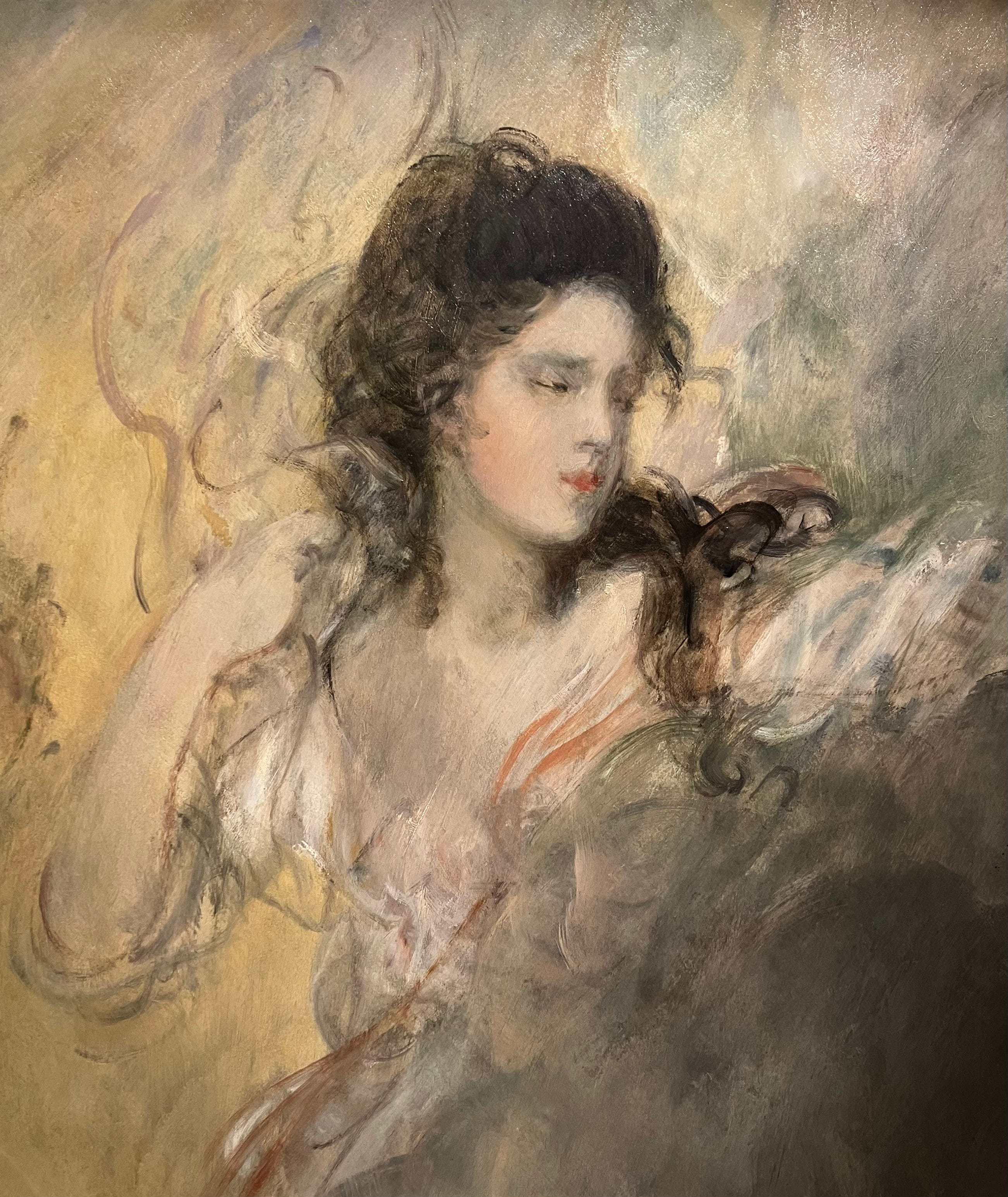
No. 2. Portrait of Mrs Sloper ‘Spiritualised’ by Thomas Gainsborough
Completed c1787, this was one of Gainsborough’s last paintings; he died the following year. I love its gauzy ethereality and the sense of looseness and freedom in the brushwork, as if the material dissolution of the spirit world finds expression in the artist’s ever softer, ever more imprecise, movements of hand and wrist. It seems a startling work for Gainsborough, and for the late eighteenth century more generally.
More shocking, though, was the discovering in Sotheby’s essay on the lot that what’s up for auction is by no means Gainsborough’s finished conception. This was one third of a larger painting, which portrayed this ghostly figure reaching down from the clouds towards two young girls in a classical colonnade, itself set in a wooded landscape. You’ll have to click through here and scroll down to see a black-and-white photo of the original piece, taken when the painting was last seen whole in 1921. It was cut into three shortly after – no, I don’t know why either. The joint portraits of the two young girls, thought to be the grand-daughters of General Sir Robert Sloper, was auctioned at Sotheby’s in 2024. You can see it here.
There seems to be some debate about the identity of the woman in this painting. It seems unlikely that it was Mrs Sloper, since she didn’t die until 1804, some seventeen years after the painting was completed. It has been suggested that the woman is, in fact, an unknown woman – Sotheby’s records that she might have been named Stokes – with whom Sloper had a relationship prior to marriage. But why then portray her in this remarkable and intense fashion, with the daughters of Sloper’s own eldest legitimate daughter?
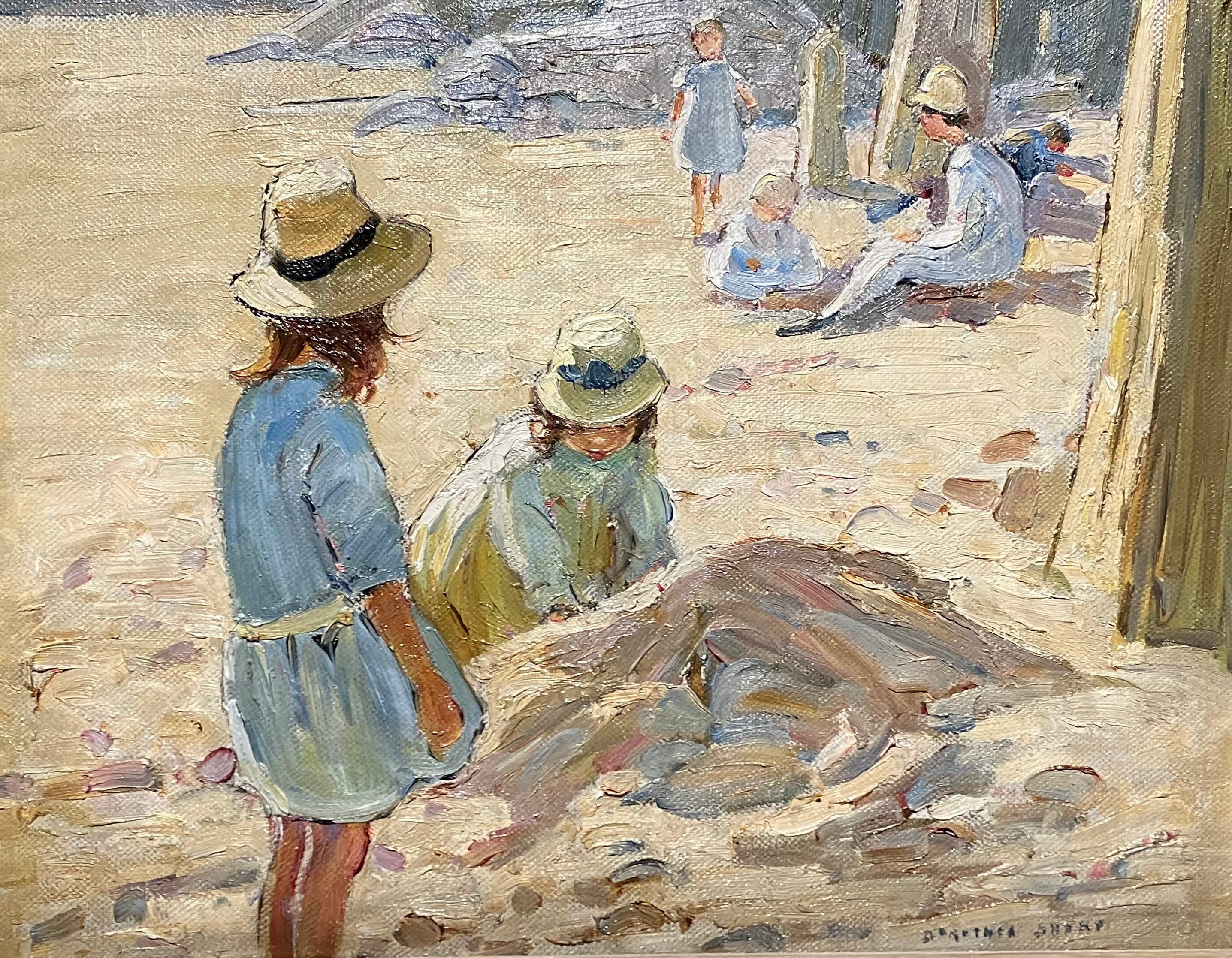
No. 3. The Sand Castle, by Dorothea Sharp
There’s not much information about this on Sotheby’s website. It’s not dated, as far as I can see, but I assume it belongs to the 1940s, by which time Sharp was approaching seventy and living in St Ives. I love the subtlety of its colour palette, the blue of the girl’s dress in the foreground, the grey-browns of the beach, the sandy yellow of the sun hats set against the pale brown sugary yellows of the sand itself, those brown suntanned legs lined by sunlight. It’s simply joyous.
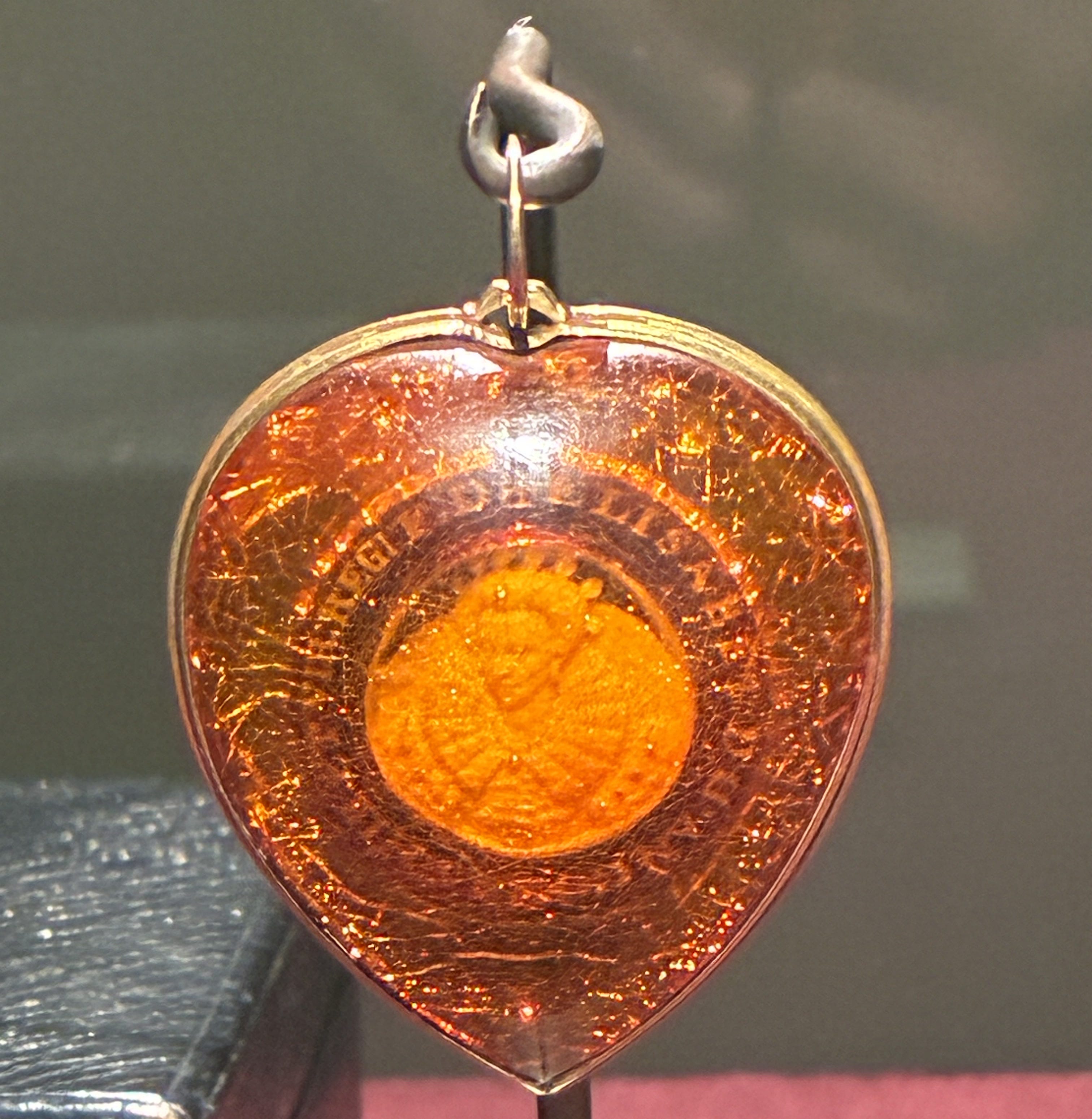
No. 4. Amber pendant with a portrait of Queen Elizabeth I, attributed to either Hans Klingenberg or Georg Schreiber
I’ve never seen anything like this, a micro-carved portrait of Queen Elizabeth I encased in an amber pendant. Amber work was known as ‘Baltic gold’ and it had become highly fashionable by the late sixteenth century, when the technique on display here, of setting a cameo or relief sculpture within it, was first developed. Various materials were used for the relief, including ivory, bone, and meerschaum, but this example is thought to be white amber.
The inscription, expanded and translated, reads: Elizabeth, Thanks Be to God, Queen of England, France, Ireland and Virginia, Defender of the Faith. The cameo itself is based on a 1592 engraving by Crispijn de Passe the Elder, itself based on a portrait miniature of the queen executed by Isaac Oliver a year or two before. It’s therefore an image of Elizabeth as she entered the last decade of her life. Given the heart shape of the pendant, and the associations that amber had with immortality – not to mention its reputation for warding off evil and protecting the health of those who bore it – this feels a resonantly intimate and personal object. As far as I can see, there is no provenance before the nineteenth century, but it would be fascinating to know who commissioned this, and whether it was created while Elizabeth was still alive. Even if it were, I think it is an artefact whose owner must always have been acutely aware of her mortality, of the moment, perhaps not long away, when you would be looking back at her and her reign, however much you wished she might persist forever.
(My apologies if the photo is a little blurred. There are more pictures on the Sotheby’s website here, including of the reverse - an image of a parrot – which I forgot to photograph at all.)
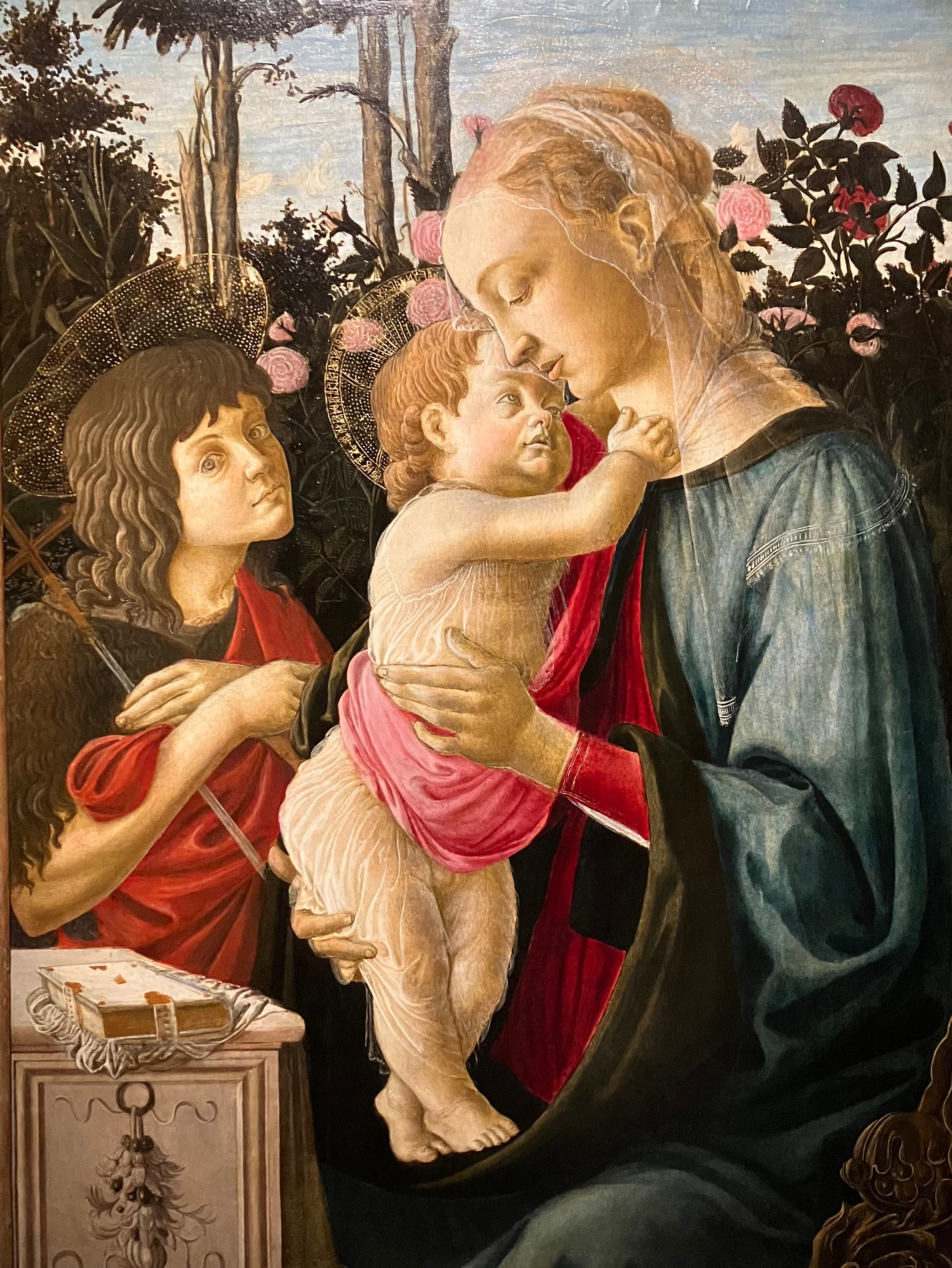
No. 5. The Virgin and Child with the young Saint John the Baptist, by Botticelli
This is one of two known versions of a Botticelli painting, the other of which is now in the Louvre. (It’s here, if you want to have a look.) It’s dated to 1468–9, when Botticcelli was in his early twenties and newly established in his own workshop in Florence after training under Fra Filippo Lippi. There is a detailed essay on the Sotheby’s website examining and comparing the under drawings of both this and its sister work in the Louvre. Significant changes to the composition – the Madonna’s face in this painting was originally a three-quarter view with eyes downcast, as opposed to the profile of the finished work, for example – lead them to conclude that the two pieces were being worked on side by side, each being corrected and improved in reference to the other.
The painting was assigned to Botticelli’s studio only for much of the twentieth century, but it is now considered to be largely in the artist’s own hand, particularly in the figures of the Madonna and child, with assistants perhaps completing the rest to Botticelli’s instructions.
I find all that kind of thing endlessly fascinating, without remotely having the expertise to essay an opinion on the rights and wrongs of the issue. There is so much that is ravishing to look at though: the child’s hand as it clasps at its mother’s neck, the extraordinary fineness of the material that swathes the child’s body, the way the Madonna’s hands in turn hold her son, gently yet firmly, and of course the beauty, the love and the sorrow, in the Madonna’s face.
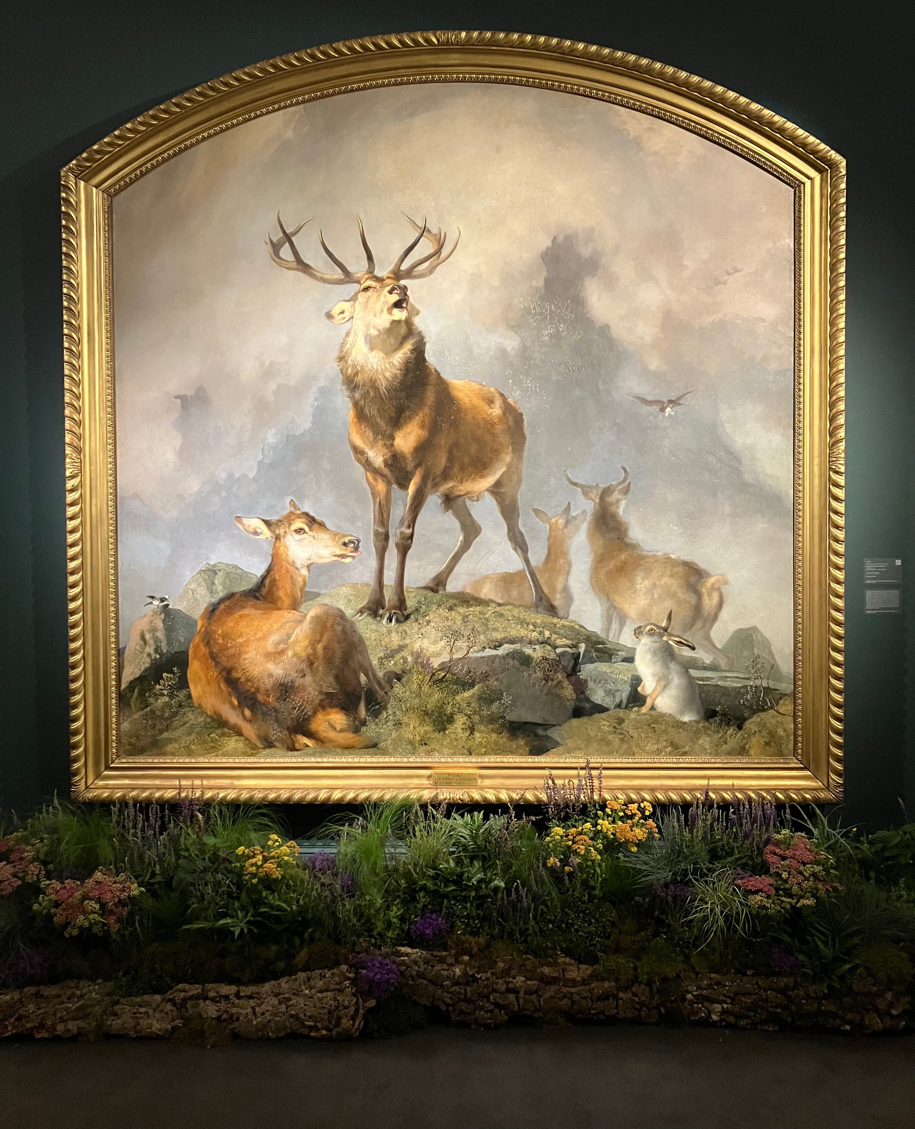
No. 6. Scene in Braemar by Sir Edwin Henry Landseer
In all honesty, had you asked me previously if I liked this kind of nineteenth-century British art I would have said no, in no uncertain terms. It makes me think of mouldy old taxidermy in mouldy old country hotels, moth-eaten hunting trophies on the wall, and the florid tweedy borishness of certain parts of the landed English gentry. Somehow the genre speaks to the imperial self-satisfaction of Victorian England more than any military image I can think of.
And yet seeing this up close, I couldn’t help but love it. It is, of course, immense. First displayed in 1857, it is said to have been conceived as a sequel to Landseer’s iconic Monarch of the Glen, which was originally intended for the House of Lords. One critic has perceived “a kind of sublime mystery” about this stag, and I agree there is something slightly mystical about it, a sense of the stag as a mythical figure as well as the embodiment of wild nature, the antithesis - the antagonist - to man the hunter. And then, the stag itself is no longer, I think, in its prime: it looks a little grizzled, a little worn, a little frail in its defiance - or all the more defiant for its gathering frailty. Is he protecting the two young deer behind, or are they on alert for him? This may sound risible, but it makes me think a little of King Lear. (I’ve used a long shot, by the way, just to show what fun the auction houses have with their exhibitions.)
Plus it is just so exquisitely painted.


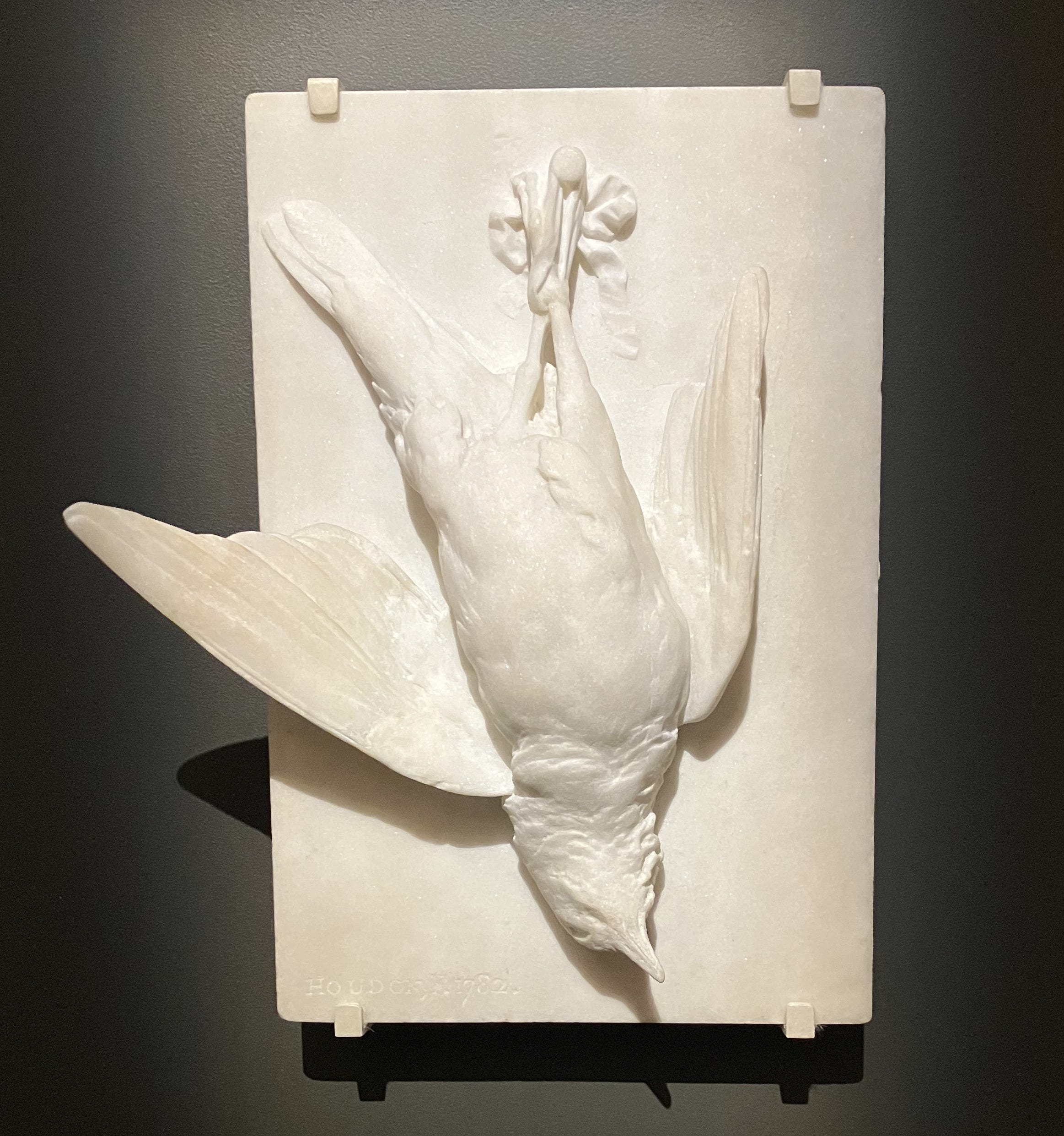
No. 7. La Grive Morte, by Jean-Antoine Houdon
Houdon was born in 1741 in Versailles and claimed to have started sculpting when he was nine years old. He would quickly become the most successful - and probably the best - portrait sculptor of the late eighteenth century, producing an endless stream of works capturing the great and the good and the wealthy of his day in marble, bronze and terracotta. He’s sometimes called the “preferred sculptor of the Enlightenment”.
This is just breathtaking. I don’t know how much I like it. It is almost too realistic for that. Or, to put that another way, why would you want to own this, however astonishing the detail of the carving? But the carving is astonishing. How well is the weight of the dead body conveyed as it hangs on a ribbon from a nail? How subtle is the stiffness of the wing feathers, the softness of the down beneath the neck?
And then there is the disconcerting idea of the piece – a dead thing that looks so ravishingly life-like in death, a fragile thing of lightness and flight captured with such delicacy in a material of such weight and solidity, the epitome of fleetingness and transcience made over into immortality by hammer and chisel.
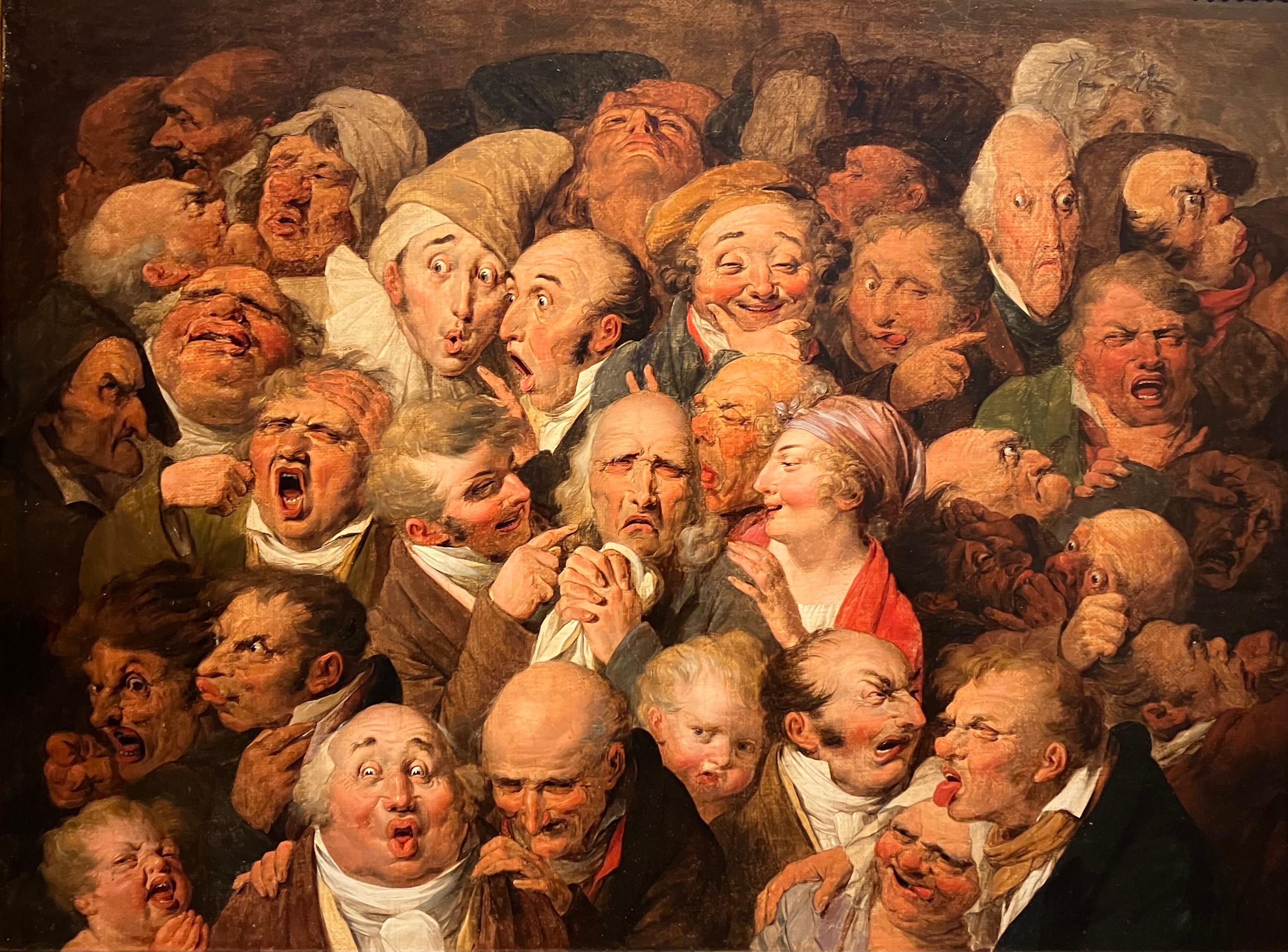
No. 8. Thirty-five Expressive Heads, by Louis-Léopold Boilly
This is wild. Again, would I want it on my wall? Probably not. But there is so much to look at and to think about. The painting dates to c1825 when the artist was in his sixties. What at first looks like a jumble emerges as a strange, brilliantly dense composition, drawing on both acute observation and a sensitivity to archetypes and grotesques. According to Christie’s, the work grew out of several decades of experimental studies which culminated in the 1820s with the production of Boilly’s Recueil de Grimaces, a collection of around a hundred lithographic caricatures which would go on have a profound influence on Daumier and other later artists.
I can’t decide if the range of grotesques is a celebration of humanity or a condemnation of it. Perhaps it is both. I think the work has the sense that you get in some great writers - I’m thinking of Dickens and Cervantes – of humanity and caricature coinciding, or co-existing, in the same person at the same time, the way that outsize performances on the stage can sometimes reach a greater kind of emotional truth. The sneering figure centre-left, his finger jabbing at the old man in tears, is a self-portrait. Is the artist cruel, or are the tears fake? Or is the weeping man the still, emotional centre of the painting, the one truth around which the increasingly extreme and self-regarding performance of feeling radiates. The painting seems to look back to the stock characters of the medieval morality plays as much as it looks forward to, I don’t know, George Grosz perhaps, as if the willingness to see ourselves in all our ugliness were an important part of the human condition.
Apparently Boilly drew on both family and friends for the portraits assembled here. I wonder if they thanked him.
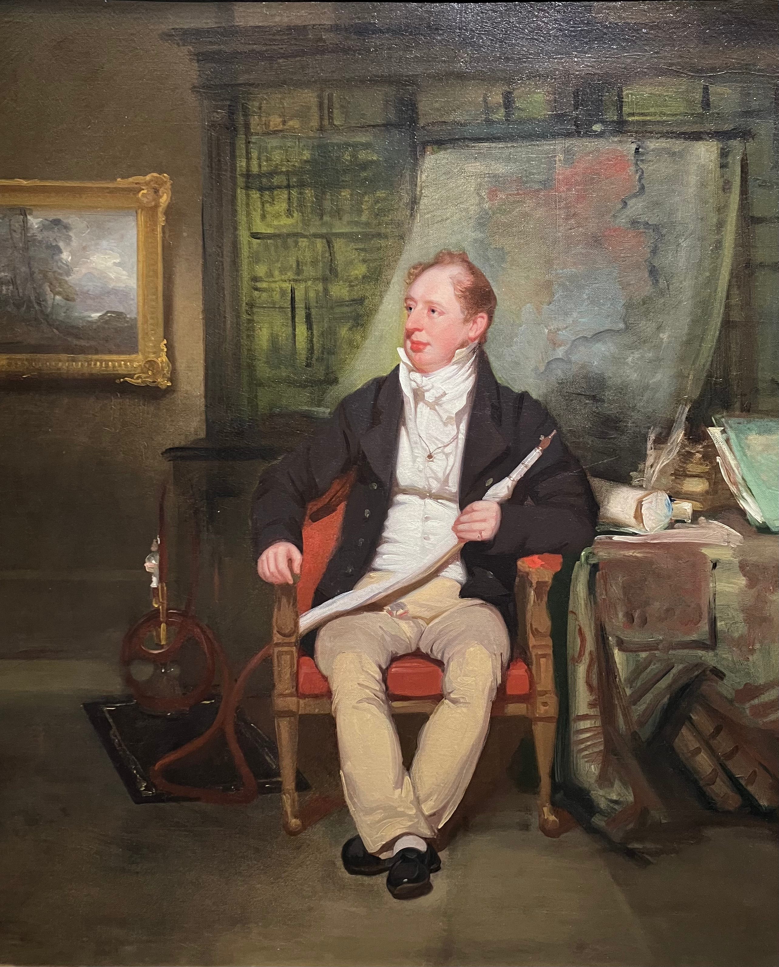
No. 9. Portrait of George Siddons, by George Chinnery
Born in 1794, Chinnery sailed for India in 1802 and lived and worked among European’s imperial possessions for the rest of his life, moving between Madras, Calcutta, Macao and Hong Kong to escape both creditors and his wife, whom he had initially left behind in England. He painted everyone from the Governor-General down.
George Siddons was definitely a step or two down from that. He was a customs officer, but his real claim to fame was as a younger son of the legendary actress Sarah Siddons, whom the DNB describes as “the greatest female performer in English theatrical history”. (She also reportedly had an affair with Sir Thomas Lawrence, whose portrait of the Duke of Wellington opened this list.)
Siddons had spent six years in Sumatra, before being posted to Calcutta in 1818 as First Deputy to the Collector of Government Customs and Town Duties. The painting portrays him in his Calcutta study, hookah pipe in one hand. He looks a contented soul to me, if not thoroughly satisfied with himself, and the informality of the pose – as if the armchair and the hookah and the comfortable footwear were all that mattered to him. I like how loosely the background is sketched in and the way that grey and stormy English landscape both draws the eye and acts as an implied counterpoint to the contentedness of the scene.
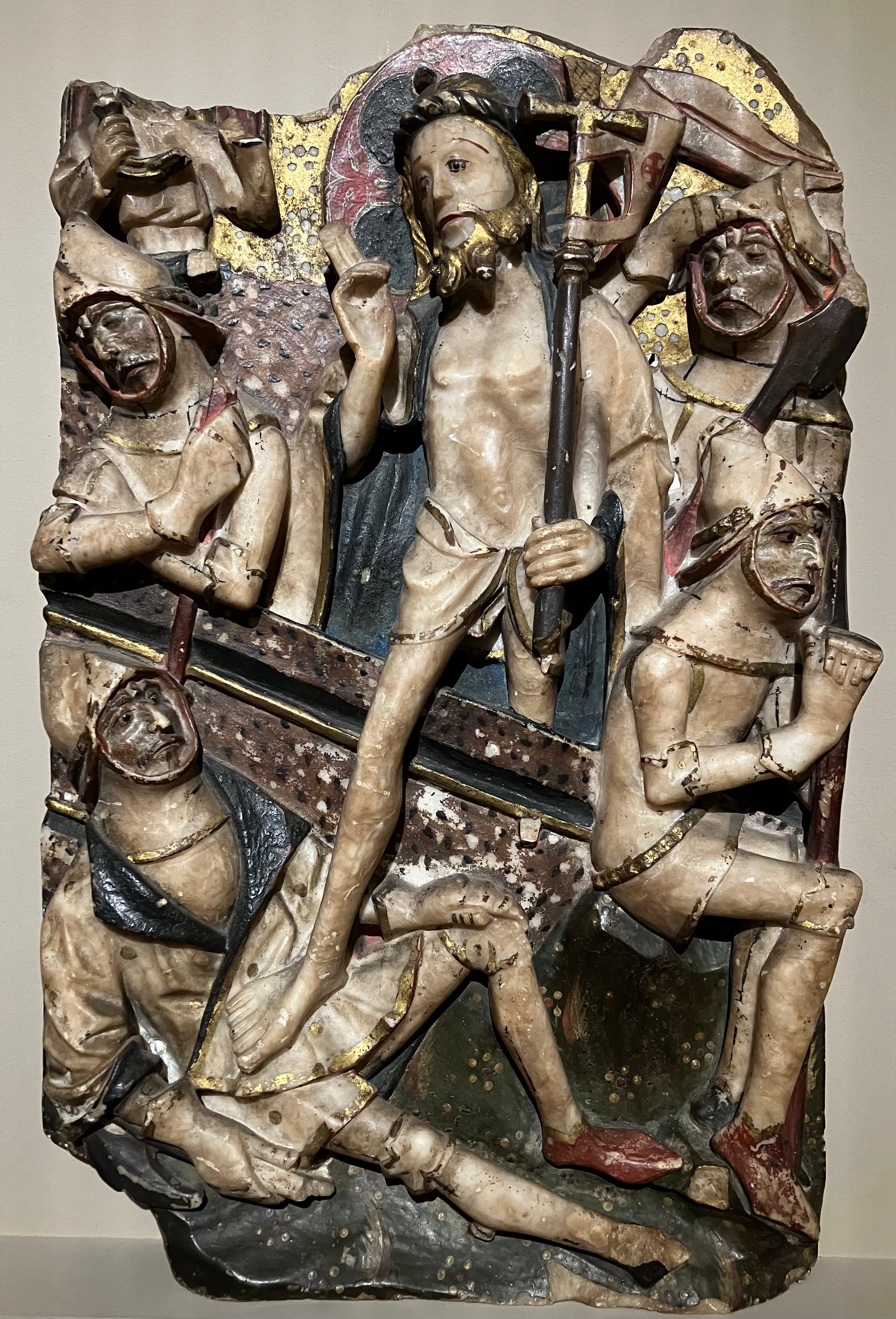
No. 10. The Resurrection
I’ve written extensively about my love of Nottingham alabaster - or, I suppose, so-called Nottingham alabaster, since much of it likely didn’t come from Nottingham – so I won’t retread old ground here. But neither could I leave this off my list of favourite things up for auction this week. This is one of two pieces at Sotheby’s. The other, an Adoration of the Magi, is in better condition. But I like the hardships this piece has endured. It seems right for the persistence of the form despite concerted attempts to destroy every trace of it. And it seems right for a subject like the Resurrection. Fragility, woundedness, faith, endurance: all facets of the beauty I see in these pieces, and in their survival against the odds. If anyone has £8k–£12k going spare, do let me know.
Again, a lovely look at what passes through the auction houses. Although, I cannot un-see what appears to be an early example of rabbit's ears behind the weeping man in no. 8.
Gosh I love that Boilly! I could live with that. The Dorothea Sharp is gorgeous. I scanned it closely for clues as to where it was painted. I may do more research…